We are an agency with several clients and have fallen in love with Lean UX. But one of our first feelings was that Lean UX is perfect for one-product-focus teams.
What about us, agencies and freelancers?
We are now going to cover everything concerning the kick-start phase of a project as soon as a client gets in touch, and with the determination to do it following Lean UX principles and methodology.
How to Run a Lean UX Workshop for Agencies and Freelancers
We are an agency with several clients and have fallen in love with Lean UX. But one of our first feelings was that Lean UX is perfect for one-product-focus teams.
What about us, agencies and freelancers?
We are now going to cover everything concerning the kick-start phase of a project as soon as a client gets in touch, and with the determination to do it following Lean UX principles and methodology.
So the workshop we are going to talk about is based on Lean UX methodology explained by Jeff Gothelf and Josh Seiden. Specifically, it's function can be indicated inside this schema designed by Jerry Cao, Content Strategist at UXPin:

I made a square to indicate the phase we are discussing: the kick-start phase.
We didn't want to make a wordy post, so what we are going to see is a tutorial of how we take care of the kick-start phase following Lean UX methodology with a client that doesn't know anything about it.
Actually the workshop is divided in two and it is as explained by Jeff Gothelf but with some adjustements for our agency format.
Specifically, we are going to see:
1) Analysis Workshop
Participants: 3–7
Duration: 3–12 hours
Schedule:
- Introduction
- Problems (30 min — 1h)
- Business outcomes (30 min — 1h)
- Proto-personas (30 min — 4h)
- User needs (30 min — 1h)
- Hypothesis table (1h — 4h)
2) Design Studio Workshop
Participants: 3–7 Duration: 3h — 15h
Schedule:
- Introduction
- Drawing (30 min — 3h)
- Presentation (30 min — 1h)
- Discussion (30 min — 1h)
- Decision (30 min — 1)
Let's begin with some what and why, and then let's dive into the practical thing.
Why run a workshop?
The first reason is:
A workshop avoids a lot of misleading and wordy meetings
UXMag explains it well: Don't Have a Meeting, Throw a Workshop.
The Second reason is that the best way to start working with your client is to break down the wall between you and him which often perpetuates the dynamic of "I'm selling you something". On the contrary, we'll build this thing together. This brings a lot of benefits and puts the client in the position of paying for the toy he puts the hands on.
The third reason is that the client rarely has clear ideas and neither does he know quite why he is asking for a project to be created.
Is this project really going to help or generate money?
When do we run the workshop?
A client has arrived and is asking us to create an e-commerce platform (for example). He doesn't know that 95% (personal stats) of e-commerce platforms published online without a strategic study fail.
Should we make him a quote and tell him we want X amount of money for the job?
We don't, instead we run a workshop.
Because, maybe the best solution could be running a landing page, or opening a shop on eBay, or maybe something else.
How do we run a workshop?
We do the following, one after the other:
- Analysis Workshop
- Design Studio Workshop
How are we Lean UX?
These two workshops are kick-starting many Lean Loops, and they meant to be repeated at each iteration, with different and ever deepener topics.
It's very important to have someone in your team covering you the budget management, basing on outcomes the work with your client. Otherwise, you will be forced to sell your work based on features, and this is not exactly Lean UX.
These two workshop, as I said, are totally picked from Gothelf's Lean UX Book and readjusted as long as we kept experimenting them with my team and new clients.
By the way, the answer to "How are we Lean UX?" is "By understanding the Lean UX principles deeply". Let me mention some important ones:
- Cross-functional teams Best medicine against waterfall.
- Outcomes, not output Getting out of the deliverable business.
- Shared understanding Collective knowledge of the team discovered together.
- No human being acting like web guru Testing is our guru.
- Permission to fail The only existing way to learn.
And many others…
Let's begin.
Meeting with the client
Before we begin we need to know the client and his project idea.
So we meet each other, and the client tells us about the project, and we speak about our work methodology.
Our speech is helped by a great Keynote's presentation and faces the following crucial points:
- No quotes, we ask for a budget
- We work through MVP and iterations
- We have to choose one stakeholder
- We work Time & Materials
I am pointing this out because workshops and Lean UX goals are not going to work well without these aspects (we will soon dedicate a post about this).
Our presentation lasts one hour and it's truly important in order to align the client with our way of moving.
Last but not least, in the meeting, we put uncertainty about the business strategy and the client's idea, then we throw a workshop.
Analysis Workshop
Participants: 3–7 (you, client(s), developers, whoever you want)
Duration: 3–12 hours
Schedule:
- Introduction
- Problems (30 min — 1h)
- Business outcomes (30 min — 1h)
- Proto-personas (30 min — 4h)
- User needs (30 min — 1h)
- Hypothesis table (1h — 4h)
Duration depends on:
- Number of participants
- Project's complexity
- If you run all the phases or not
1) Introduction
We are in a room with a table and a beautiful wall. If we don't have whiteboards, Amazon has the electrostatic ones. They are just amazing!
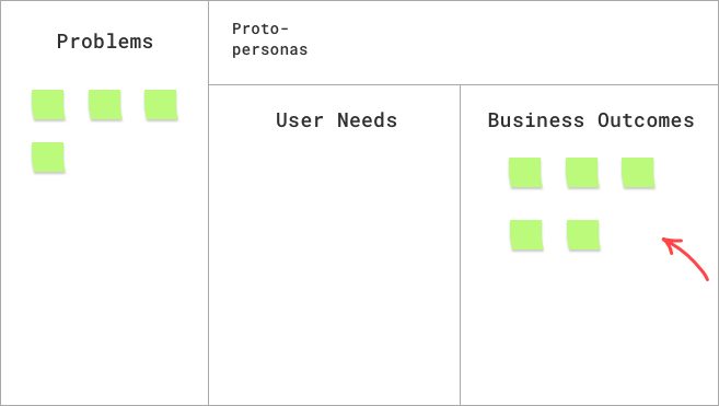
Let's organise the wall this way:
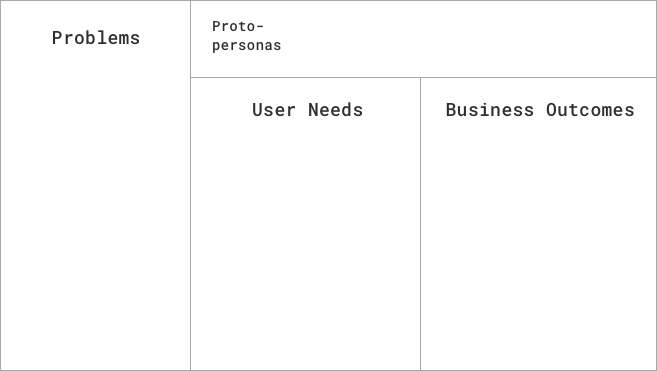
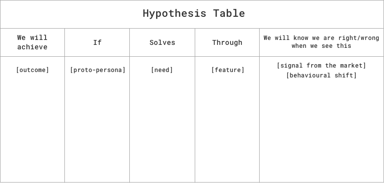
And let's dedicate a whiteboard to this table (i.e. our final output):
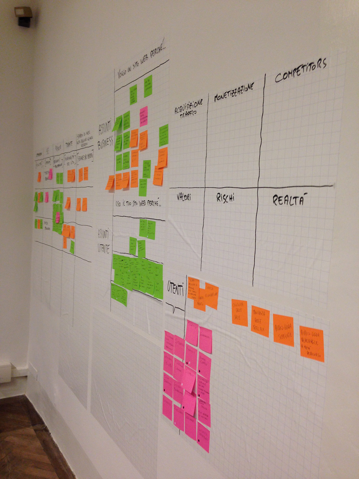
Recently we have run this workshop at Uffizi Gallery, and everything we have asked for was a table, chairs, and a 6x3m wall.
Here's the wall at the end of the first day of workshop:
Useful materials before starting
Here is something that could help which needs to be prepared before the day of the workshop:
- Reports of past user testing sessions
- Past attempts of solving the same problems
- Reports of software of web analysis such as Analytics, MixPanel, FullStory, etc.
- Surveys results oriented to clients or employers
Now, let's dive into practical things.
2) Problems
Duration: 30 min — 1h.
This is where the workshop starts.
First of all, we need to find a list of all the problems concerning the current status of the company/client that got in touch with us and is the motivation behind the product idea.
What do we want to improve? Which are the frustrations, problems, obstacles of the current status?
It's from these answers that our client came up with an idea, and afterwards looked for us.
We are going now to print a paper for each participants , with these words:
The current status of our
[service/product]
presents:
[needs/frustrations/problems]
which we think we can solve through:
[vision/strategy]
Let's assign 15 minutes for each participant. Everybody in silence is going to write his own answers which are going to be read aloud.
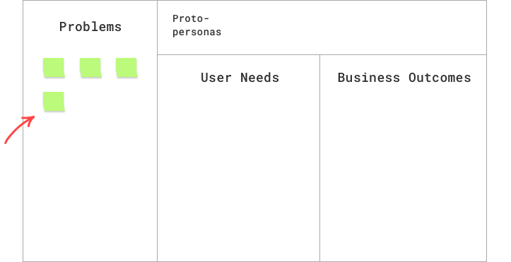
Let's stick post-it for each problem, in the whiteboard entitled "Problems".
3) Business outcomes
Duration: 30 min — 1h.
Based on the problems previously listed, each participant now takes 15 mins to write on a paper a list of the outcomes we, as product owners, would like to achieve.
"_Business_" doesn't have only an economic meaning but also a qualitative one.
Example:
Problem:
Our employers don't communicate to each other.
Business outcome:
Enhance the communication system between employers.
This will always be an opened whiteboard where we are going to add new post-it as long as we proceed.
4) Proto-personas
Duration: 30 min — 3h.
The shortest version (30 min) of this phase consists into the list of types of human beings who would interact with our product.
Longest version (3h, and strongly suggested) consists in the same list, as well as its deepening.
What are proto-personas?
Personas are types of user who interact with our product and whose existence is validated through surveys, market research, etc. We give them a name, role, age, etc.
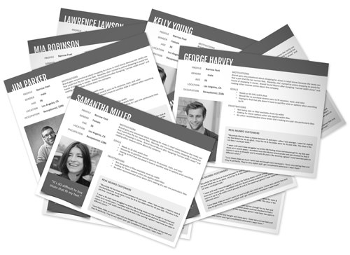
Proto-personas are like personas but without validation through research. Or better, validation occurs in a second moment. They were born from the need to begin work on a product immediately, not spending too much time on preliminary work.
Experience moreover teaches us that 90% of time proto-personas are well guessed, and UX Design work flows efficiently.
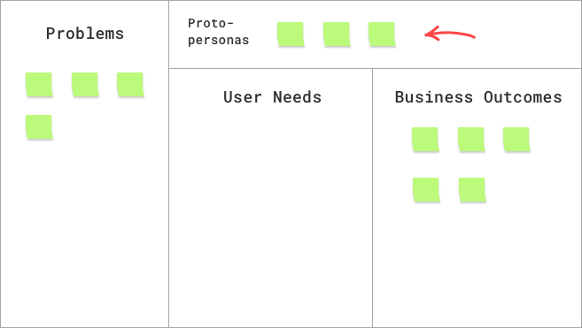
Once the proto-personas list is done, and many post-its are attached for each one:
We are going to give to each participant a different proto-persona, together with a template:
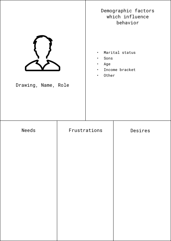
Feel free to download the pdf template here.
Through time we have discovered that the three columns below can be merged into "needs/frustrations" or just "needs". However, I suggest to experiment and find your own preferences.
Each participant has from 30–90 min to design his proto-persona.
After that, alternately everyone presents his own:
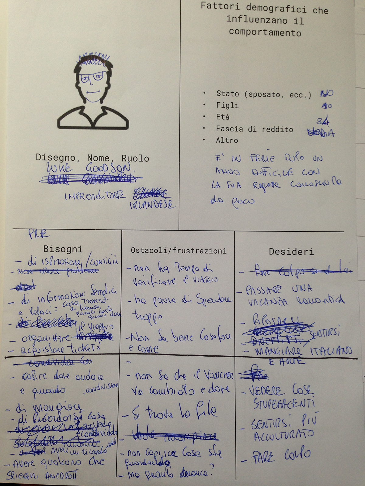
In this (Italian) example above we have even divided user needs/frustrations into three more categories (of time):
- Pre-experience
- Experience
- Post-experience
In the context of the visit at the Uffizi's Gallery Museum has been perfect:
- Pre-experience: I organise my visit
- Experience: I do my visit
- Post-experience: I come back home and I remember my visit
We haven't been able to test this time splitting into other projects though, so we don't know exactly if it fits always well.
5) User needs
Now we are going to select one, two or three proto-personas to focus on.
All together, re-reading proto-personas, we find the needs/frustrations which we judge more relevant.
We fill the part "user needs" with post-it related to these needs. We can divide again the whiteboard, or draw a line between the proto-persona's post-it and his needs.
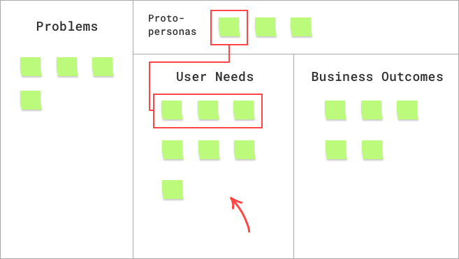
Did this, we are ready for the hypothesis table.
6) Hypothesis Table
Now let's place everything we have done before, inside the Hypothesis Table.
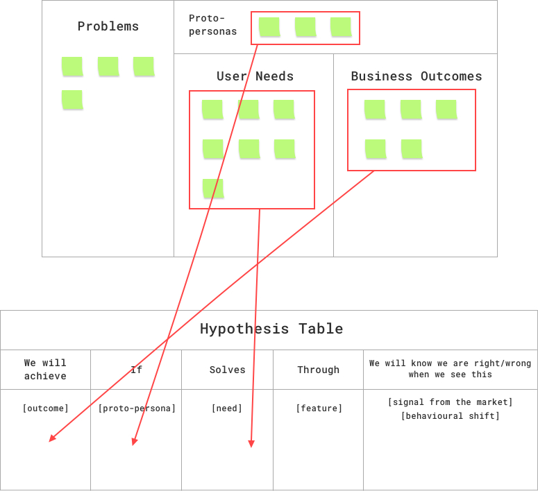
Hypotheses are everything that is going to create the basis of the future phase of development (for those who are confident with Scrum, they are very similar to User Stories).
Here is the template of a hypothesis, built from the table above:
We believe we will
achieve
[business outcome]
if
[proto-persona]
solves
[user need]
through
[feature].
We will know we are right/wrong when we see this [signal from the market/behavioural shift].
This is the most meaningful part of the workshop.
It tells us that we have been doing a work in order to result a list of features reasoned by both sides (user and business), and with a KPI associated.
KPI = "Key Performance Indicator"
It corresponds to the [signal from the market/behavioural shift] above.
What does it mean? We have written a Hypothesis Table. This means getting out of the requirements bad habit, where a client or a good UX Designer impose us what we have to do based on pretty anything.
Let's be clear: at this point we neither have done pretty anything, but we created the basis to test and iterate throughout time on tangible and lean products. We created the basis to keep going monitoring KPI and taking decisions based on data.
Here we are claiming (in the form of hypothesis) that we are going to solve frustrations and achieve business outcomes through specific features.
After that, via Galileo's scientific method method, we look for the validation of our hypothesis, in our case through KPI (Again: "_Key Performance Indicator"_).
Examples of KPI :
- 4% increase of mailing list Open Rate
- 2% increase of website signups
- 3% increase of app download
And many other things like campaigns specially designed to do the KPI job.
Here is an example of hypothesis:
We believe we will
achieve
Increase of expiring food products selling
if
Max — usual customer (33 years old)
solves
Buy good products at low cost everyday coming back from work
through
Products Highlight in homepage
Targeted e-mail marketing campaign
Lead Nurturing on new segment of clients
We will know we are right/wrong when we see this 10% increase of expiring product selling, after one month from the first started campaign.
With this table the Analysis Workshop ends.
Design Studio Workshop
Participants: 3–7
Duration: 3h — 15h
Decription
Lots has been written about this practice, especially Google literature about Sprint Design.
However we haven't been able yet to place Sprint Design sessions in a saleable package in our agency. Basically, they cost too much or anyway they are (just my opinion) better applicable in startup environments or one-product-focus teams ( this is an interesting post about this topic).
Therefore we rely on Design Studio sessions, also taken by Lean UX methodology, and certainly effective.
This workshop is about designing the product (screens, architecture, scenarios, etc.)
Schedule
- Introduction
- Drawing (30 min — 3h)
- Presentation (30 min — 1h)
- Discussion (30 min — 1h)
- Decision (30 min — 1)
1) Introduction
Our workshop begins re-reading all the material produced in the previous workshop, specially the Hypothesis Table.
Each participant receives some super-sized paper, markers, highlighters, etc.
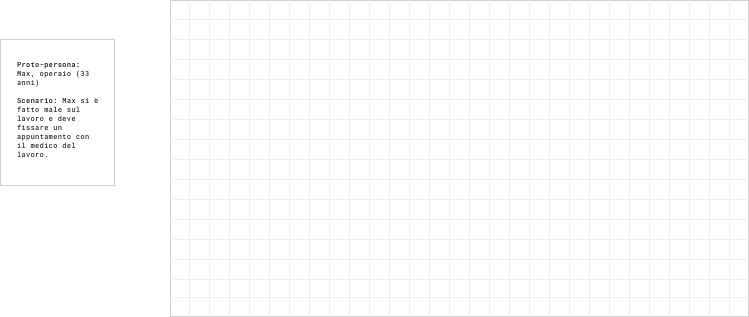
Each participant receives a proto-persona and a scenario, for example:
Proto-persona:
Max, labourer (33 years old)
Scenario:
Max hurts himself in the work place and has to request an appointment with the doctor.
Here is the big paper and the instructions:
2) Drawing
Duration: 30 min — 3h
Participants have to draw:
- Product's architecture (app, website, etc.)
- Example of usage of the product in his scenario
This should be drawn for at least two solutions (if you have assigned enough time to this phase).
Product's architecture
Basically we are talking about the screens:
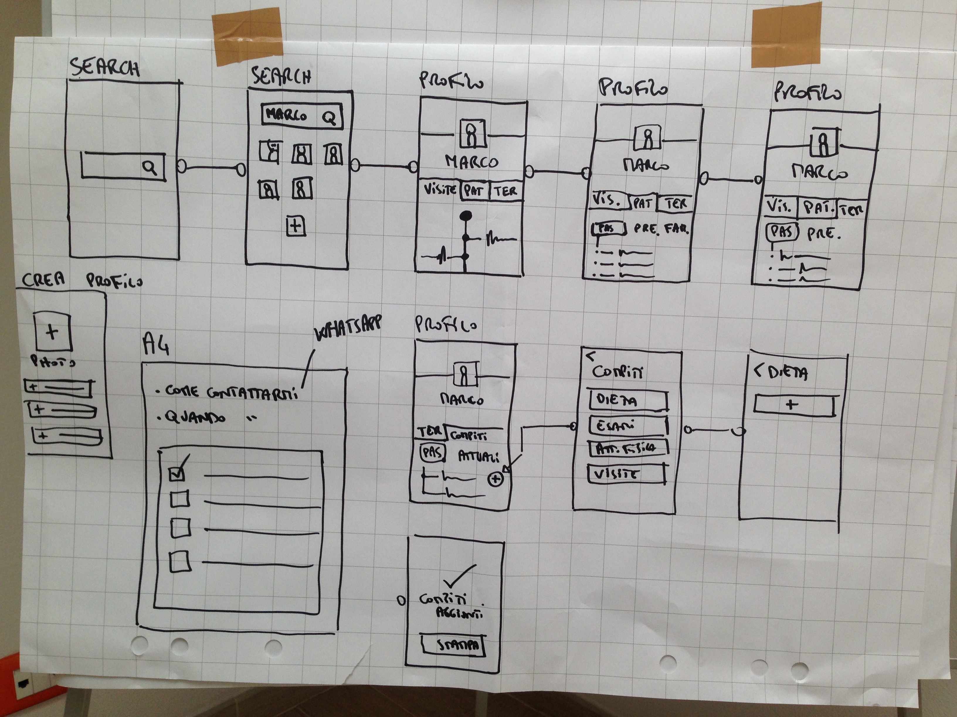
What often happens is that everybody get scared at the beginning, because they think they don't have skills, but at the end you realise that everybody draw solutions one thousand times better then the UX Designer or whoever is running the workshop does.
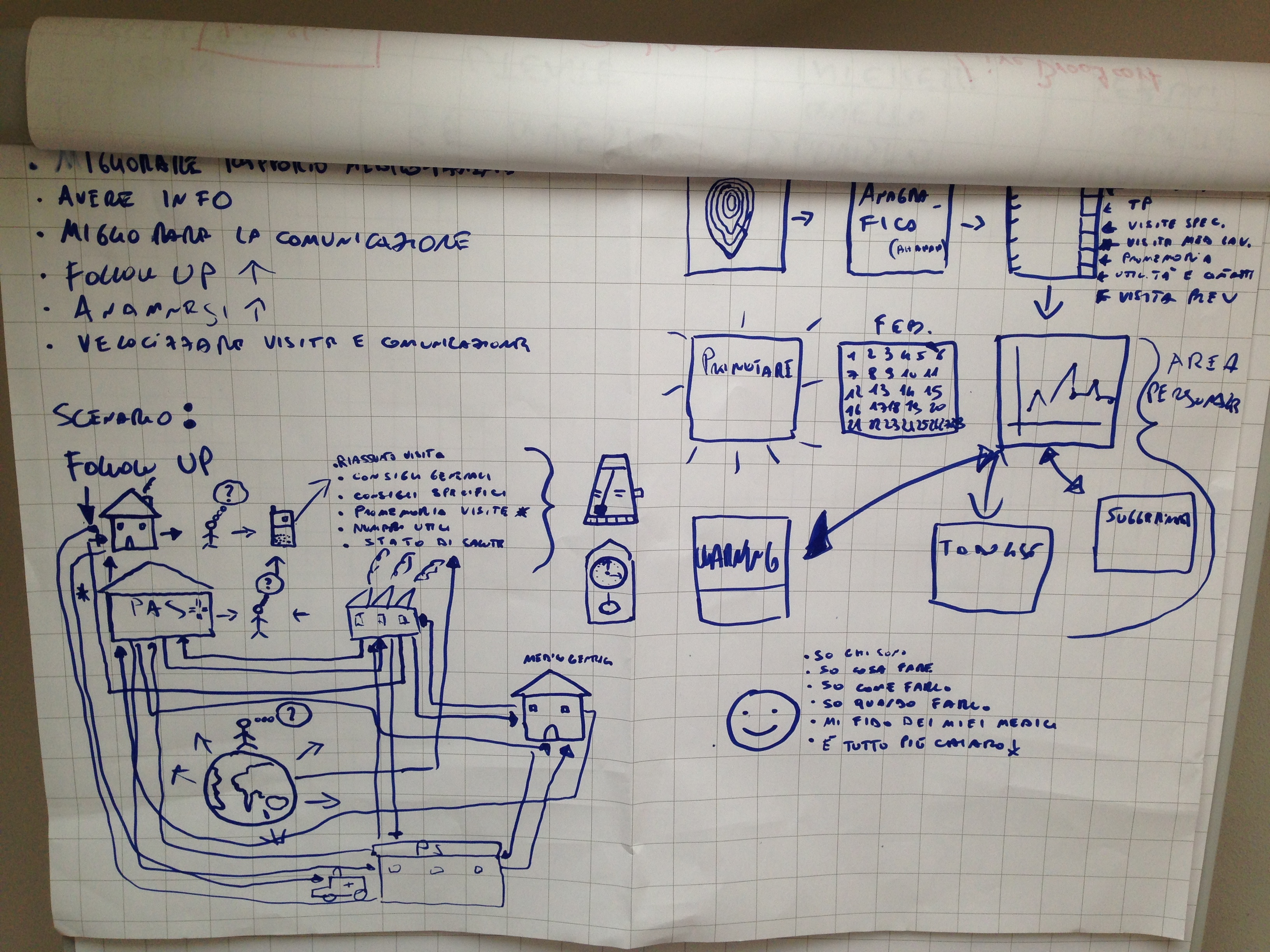
Example of usage of the product in the scenario
This second task can be done with drawings, schemes, and everything which allows the participant to communicate an idea:
Duration
Generally we organise drawing during morning, and presenting ideas and solutions in the afternoon.
3) Presentation
Durata: 30 min — 1h
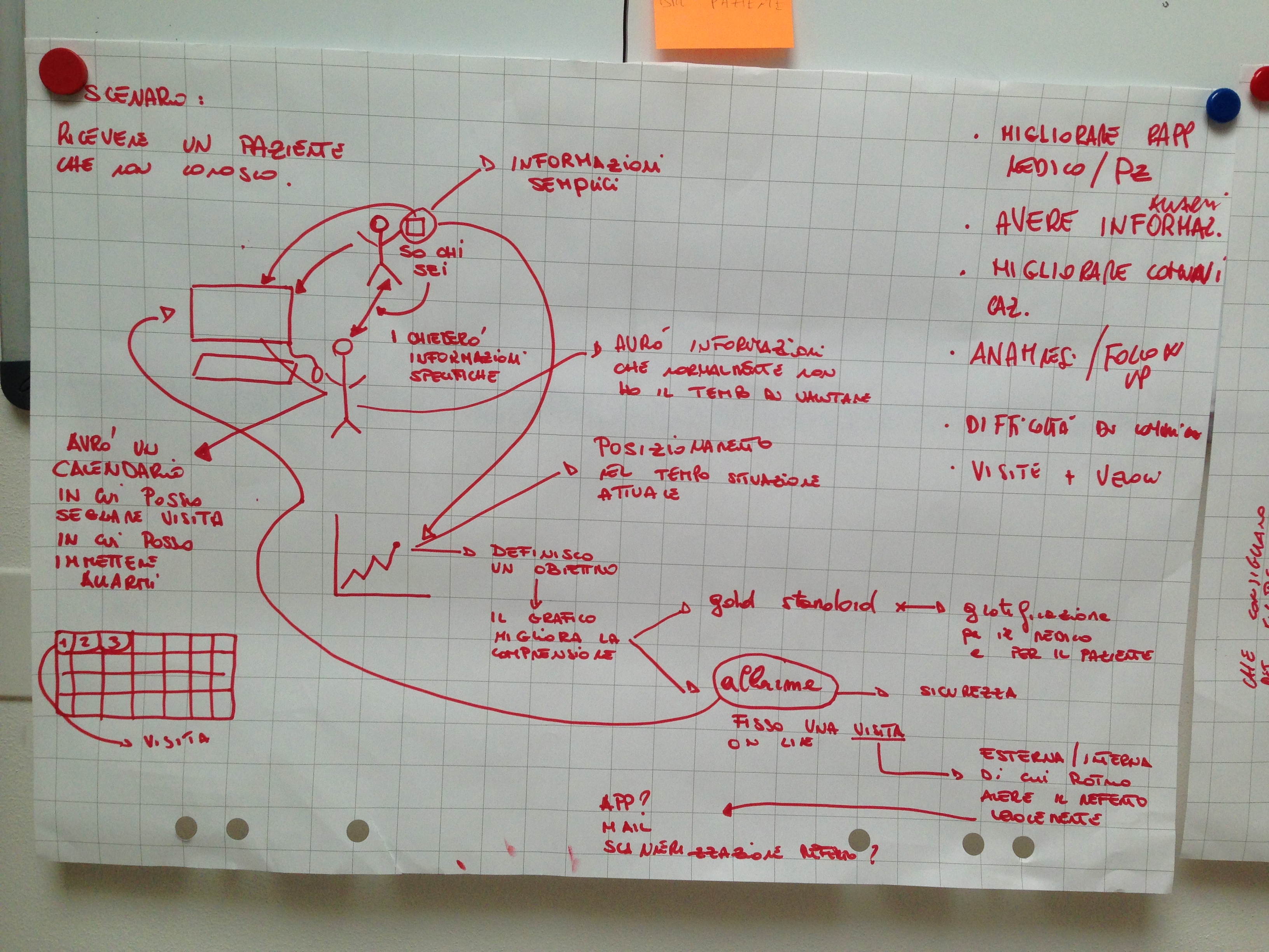
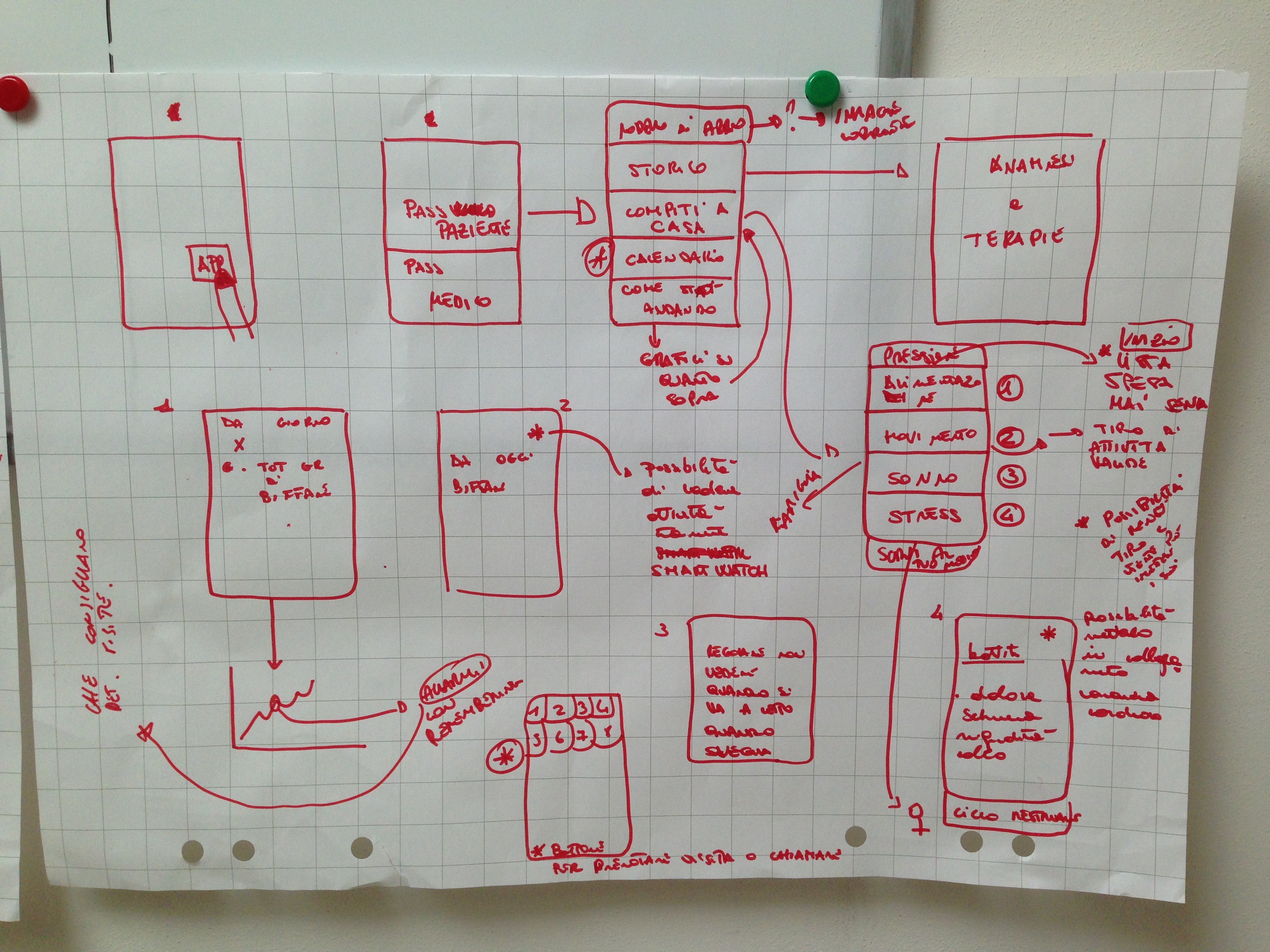
One by one, participants stand up and present their solutions sticking their big papers on the wall:
4) Discussion
Duration: 30 min — 1h
Both for the presentation and the end of all the presentations, we discuss solutions, and we move towards the final one (or ones) which we share and consider the rightest one. This is done by modifying, improving, and merging all the solutions. It is creative work and with a few rules.
5) Decision
Duration: 30 min — 1h
Here we formalise the final solution (or solutions).
With this material Design Studio Workshop ends.
And now?
If we are at the first job with the client, we have to get some more analysis work done. They will allow us to estimate the feasibility of goals in time.
I know that big product estimates stay at the opposite corner of Lean UX principles, but client always need to know where they can arrive with a certain budget, and this is our current solution. If anybody knows how to avoid this please write a response let's discuss good solutions.
Actually, consolidated clients don't need this.
How do we set a budget?
You have two roads:
- Basing your budget on features to implement
- Basing your budget on outcomes to achieve
Challenges are:
- Teaching your client to think with a Lean UX mentality (we run a good presentation to do this and teach the client to use tools like Pivotal, etc.)
- Have a good part of your team (or initially one person) able to base a work on business outcomes.
Conclusions
There would be a lot more to write, and in the future we are going to speak more about everything which happens from now on, i. e. here:
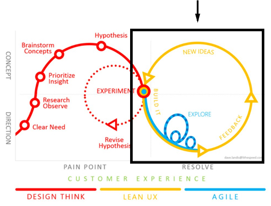
While in this post we covered what happens here:
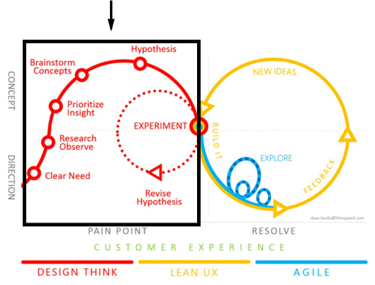
I am curious to know how other agencies and freelancers move in this context, and if this post have been useful.
For every question, leave a comment below.
Some final notes
- Focus: We rather prefer individual focus than brainstorming exercises, appreciating the reasons explained by Jake Knapp here.
- Breaks: In every workshop it's important to have breaks previously scheduled and communicated to the whole team (coffee, launch, etc.).
- Time: Before proposing this workshop to a client I strongly suggest to test it with your own team, in order more than anything else test durations. In the past it has happened to me to manage moments of stress caused by impossibility to accomplish everything inside our schedule.
- Rules: we suggest to forbid phones and laptops.
- Everybody participation: who is running the workshop can encourage everybody to talk making them read aloud texts or asking them opinions.
